BLOG
An archive of tips, tricks and tutorials on how to make the best use of ApexCharts library.
New Licencing Model
Posted byApexCharts Has Big News: A New Licencing Model to Drive Charting’s Future Developers that want beautiful, interactive charts without the bloat have long used ApexCharts. It’s been amazing to watch ApexCharts develop into a reliable data visualization solution for teams ranging from Fortune 500 companies to independent hackers and startups. We’re making a big announcement […]
Read MoreThe bitterness towards pie charts hurts great visualization
Posted by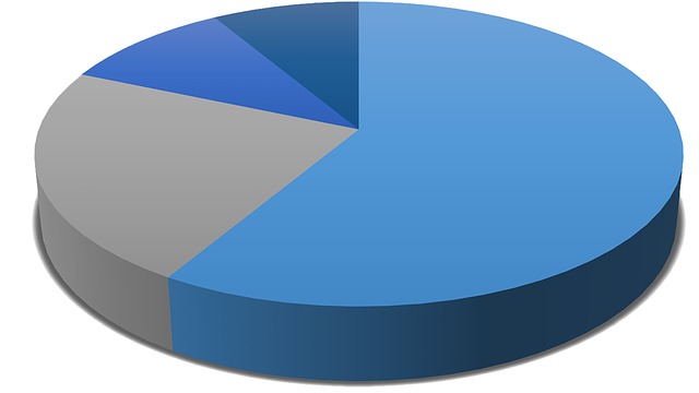
Data visualizations are an indispensable part of your business; they make it easy for you or viewers to understand, and also make your data interesting to read. However, if you are the type that feels depressed immediately you see a chart, then something is wrong.
Read MoreComparison Table
Posted by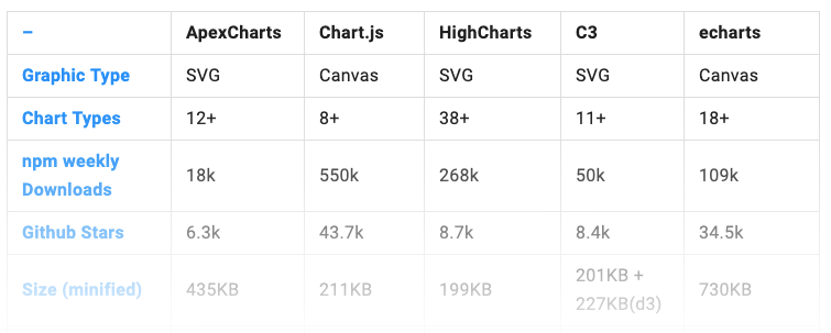
The comparison table tries to provide an illustration of the similarities/differences among different JavaScript Charting libraries available. Take a look at how ApexCharts compares with the most popular JavaScript Chart libraries.
Read MoreHow to choose the right colors for your charts?
Posted by
Data visualizations are an indispensable part of your business; they make it easy for you or viewers to understand, and also make your data interesting to read. However, if you are the type that feels depressed immediately you see a chart, then something is wrong.
Read More
Reset Password
Enter your email address and we'll send you a link to reset your password.
Back to Login
Please wait...