Line breaks and multiline text in axes labels
How to handle long text in axes labels
One of the common scenarios in charting is to display informative text labels on the x-axis as well as on the y-axis (in case of horizontal bar charts).
In this how-to guide, we will take a look at how to achieve line breaks and multiline labels by slightly modifying the text input of the categories.
Default long labels in x-axis
By default, long labels in the x-axis are rotated -45° if it doesn’t fit the available area. Even more, the labels are then truncated if it still overflows the region. This default behavior is implemented keeping in mind the user doesn’t have to manually truncate or rotate the labels if it exceeds the size.
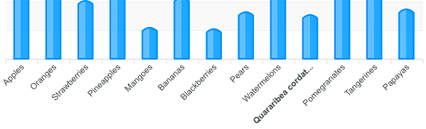 The xaxis code used for the labels shown above is as follows
xaxis: {
  categories: [
    'Apples',
    'Oranges',
    'Strawberries',
    'Pineapples',
    'Mangoes',
    'Bananas',
    'Blackberries',
    'Pears',
    'Watermelons',
    'Quararibea cordata (Chupa Chupa)',
    'Pomegranates',
    'Tangerines',
    'Papayas'
  ]
}
Modifying the labels for line breaks
As shown in the above code snippet, the categories array consists of string items. To enable multiline text and word wrapping, we have to provide an array of strings for each word we need to give a line break. The code below will provide a clear idea.
xaxis: {
  categories: [
    'Apples',
    'Strawberries',
    'Pineapples',
    ['Sugar', 'Baby', 'Watermelon'],
    ['Prickly', 'Pear'],
    'Pears',
    ['Quararibea', 'cordata'],
    'Pomegranates',
    'Tangerines'
  ]
}
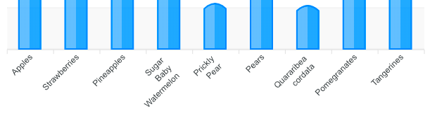
You may notice that even though you provided an array in the category labels, the text is still rotated. This is a valid behavior as there were too many labels to fit in the space.
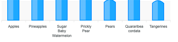
To turn off the rotation of the x-axis labels, you will have to set the following properties.
xaxis: {
  labels: {
    rotate: 0
  }
}
Once you disable the rotation of the labels, you will see the following image. For the purpose of the demo, I have removed some items from the original array to avoid trimming off the texts.
Line breaks in y-axis labels in horizontal bar charts
The above example was for category bar charts with vertical columns. Below we will see how to achieve the same for horizontal bar charts.
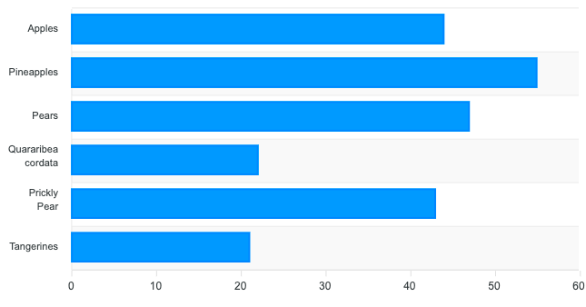
By default, long labels in a horizontal bar chart produce the following image. Notice that the horizontal bar charts labels are still provided in xaxis.categories.
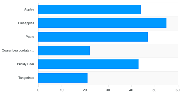
xaxis: {
  categories: [
    'Apples',
    'Pineapples',
    'Pears',
    'Quararibea cordata (Chupa)',
    'Prickly Pear',
    'Tangerines'
  ]
}
Enable line break in horizontal bar charts axis
There is no difference in configuring the horizontal bar charts labels than in other cartesian charts. Just convert the normal string to an array of strings.
xaxis: {
  categories: [
    'Apples',
    'Pineapples',
    'Pears',
    ['Quararibea', 'cordata'],
    ['Prickly', 'Pear'],
    'Tangerines'
  ]
}
Reset Password
Enter your email address and we'll send you a link to reset your password.
Back to Login
Please wait...